

7 Game-Changing Web UI Features You Can Start Using Today
I was watching this video from the Google IO on all the new web UI features that are coming to the web platform and I was blown away by how many of these features are already available in modern browsers.
In this article, I want to highlight 7 of these features that I think are game-changing and that you can start using today (of course, in some of the modern browsers).
- CSS Text Box
- CSS Scrollspy
- Contrast Color
- The hidey bar using @scroll-state query
- Gap Decorations
- The
light-dark()function - The
linear()function
CSS Text Box
A new property called text-box is coming to the web platforms that allows you to trim extra leading and verical whitespace above and below the text glyphs, enabling precise pixel-perfect alignment and typgraphy layouts without arbitrary negative margins.
The short-hand for the text-box property:
text-box: trim-both cap alphabetic;
The long-hand version of the text-box property:
text-box-trim: trim-start | trim-end | trim-both | none;
text-box-edge: cap | ex | text | leading + alphabetic | text;
As you can tell, the text-box property has two parts. The first part is the text-box-trim property which controls how the text box is trimmed. The second part is the text-box-edge property which controls which edge of the text box is used for alignment.
This is essentially useful for when you want to align text with other elements on the page and you don’t want to use negative margins or padding to do so.
The following CodePen demonstrates how this looks like in action.
See the Pen Interactive CSS text-box by web.dev (@web-dot-dev) on CodePen.
In real world, this can be useful in scenarios where the extra leading and vertical whitespace above and below the text glyphs can cause misalignment with other elements on the page. Take this for instance.
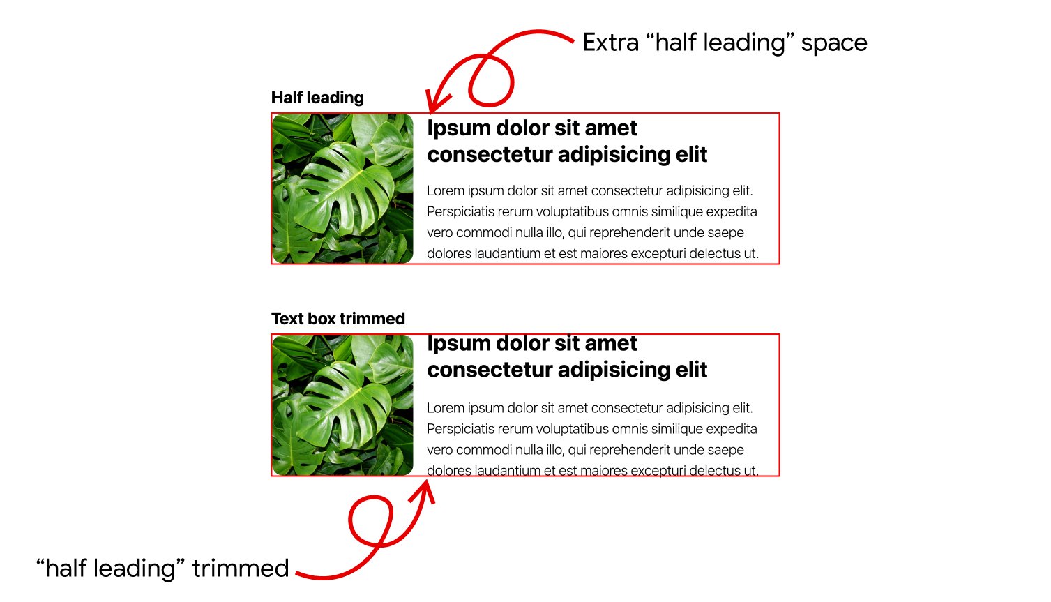
As you can tell, with the text-box property, we are able to align the text with the image quite nicely without having to use negative margins or padding.
CSS Scrollspy
Another interesting new property called scroll-target-group can be used to create a scrollspy effect on a page. So, if you don’t know what a scrollspy effect is, it’s a web design UI pattern where navigation links or table-of-contents items automatically update and highlight in real time based on the section of the page currently visible in the user’s viewport.
To implement this, you will need to have a list of navigation links or table-of-contents items that are possibly combined under an element like <ol> or <ul>. And these navigation links are tied to the sections of the page that they represent using the href attribute. The sections of the page are marked with an id attribute that matches the href attribute of the navigation links.
Something like this.
<ol id="toc">
  <li><a href="#section1">Section 1</a></li>
  <li><a href="#section2">Section 2</a></li>
  <li><a href="#section3">Section 3</a></li>
</ol>

<section id="section1">
  <h2>Section 1</h2>
  <p>Content for section 1...</p>
</section>
<section id="section2">
  <h2>Section 2</h2>
  <p>Content for section 2...</p>
</section>
<section id="section3">
  <h2>Section 3</h2>
  <p>Content for section 3...</p>
</section>
Now, we can implement the scrollspy effect using the scroll-target-group property like so.
ol {
  background-color: gray;
  right: 10px;
  top: 10px;
  position: fixed;
  scroll-target-group: auto;
}

a:target-current {
  color: red;
}

section {
  background: lightgray;
  height: 60vh;
  margin: 10px;
}
Here’s how it looks like in action.
See the Pen CSS Scrollspy by Amit Merchant (@amit_merchant) on CodePen.
This property unlocks a lot of possibilities for creating scrollspy effects without having to rely on JavaScript. You can also use this property to create other interesting effects like highlighting the current section in a table-of-contents, or even creating a progress bar that fills up as the user scrolls through the page.
Contrast Color
Have you ever been in a situation where you have a background color and you want to set the text color to be readable against that background color and you’re not sure what color to use for your text? Well, the new contrast-color() function in CSS can help you with that.
The function takes a valid CSS color value as an argument and returns a color that has sufficient contrast against this color. This is useful for ensuring that your text is readable against different background colors.
color: contrast-color(purple);
/* Returns: white */

color: contrast-color(yellow);
/* Returns: black */

color: contrast-color(var(--brand-color));
/* Returns: whichever of black or white has higher contrast */
Here’s a CodePen to demonstrate how this works.
See the Pen contrast-color() by Amit Merchant (@amit_merchant) on CodePen.
Hover over the boxes to see how the text color changes dynamically based on the background color. The contrast-color() function ensures that the text is always readable against the background color.
The hidey bar using @scroll-state query
A new type of CSS scroll-state media query is coming to the web platform that allows you to create a hidey bar effect on your website. This is useful for creating a navigation bar that hides when the user scrolls down and shows when the user scrolls up.
Here’s how that works.
html {
  container-type: scroll-state;
}

header {
  position: fixed;
  inset: 0 0 auto;
  transition: translate 0.25s;
  translate: 0 0;

  /* Slide header up when last having scrolled towards the bottom */
  @container scroll-state(scrolled: bottom) {
    translate: 0 -100%;
  }
}
As you can tell, first, we set the container-type property to scroll-state on the html element. This allows us to use the @container rule to query the scroll state of the container.
Next, we set the position property of the header element to fixed and set the inset property to 0 0 auto. This positions the header at the top of the viewport.
Then, we set the transition property to translate 0.25s to smoothly animate the translation of the header when it hides and shows.
Finally, we use the @container rule to query the scroll state of the container. When the user scrolls down, we translate the header up by setting the translate property to 0 -100%. When the user scrolls up, we translate the header back down by setting the translate property to 0 0.
Here’s a CodePen to demonstrate how this works.
See the Pen Hidey Bar Demo (Hide on Scroll Down, Show on Scroll Up // Scroll State Queries) by Bramus (@bramus) on CodePen.
Gap Decorations
CSS Gap Decorations allow you to draw visual lines (dividers) between items in a Flexbox or CSS Grid layout using native CSS properties, eliminating the need for extra HTML elements or complex CSS workarounds.
Previously, styling gaps between layout items required workaround solutions, such as adding extra <div> elements, setting outer borders, or applying pseudo-elements (::before / ::after).
These workarounds had several drawbacks:
- Cluttered Markup: Required adding unnecessary HTML elements solely for visual presentation.
- Accessibility Issues: Unnecessary decorative elements cluttered screen reader output.
- Maintenance Overhead: Complex geometric calculations were needed to prevent unwanted border overlaps.
With gap decorations, you can directly style gaps in Grid and Flexbox containers:
column-rule: Styles vertical gap lines between columns.row-rule: Styles horizontal gap lines between rows.rule: A shorthand property that applies styles to both row and column gaps simultaneously.
And here’s an example of how to use it.
.container {
  display: flex;
  column-rule: 2px dashed #ccc; /* Adds a dashed divider between columns */
  row-rule: 1px solid #ddd;    /* Adds a solid divider between rows */
}
Here’s a simple CodePen to demonstrate how this works.
See the Pen Gap Decorations by Amit Merchant (@amit_merchant) on CodePen.
The light-dark() function
A really nice addition to the CSS color functions is the light-dark() function which is also now widely supported across all modern browsers. This function allows you to define a color that adapts to the user’s preferred color scheme (light or dark mode).
For this function to work, you first need to define color-scheme property on the html element like so.
html {
  color-scheme: light dark;
}
What this does is it tells the browser that your website supports both light and dark color schemes. Now, you can use the light-dark() function to define colors that the browser will automatically switch between based on the user’s preferred color scheme.
.card {
  background-color: light-dark(
    #fff, /* Light mode color */
    #000  /* Dark mode color */
  );
  color: light-dark(#000, #fff);
}
And recently, the light-dark() function has been updated to also accept images, where instead of defining a color for light and dark mode, you can define an image for light and dark mode.
.card {
  background-image: light-dark(
    url('light-mode-image.jpg'), /* Light mode image */
    url('dark-mode-image.jpg')  /* Dark mode image */
  );
}
The linear() function
If you’ve ever wanted to implement natural, physics-based easing animations (such as bouncy or spring-like effects) without relying on heave JavaScript animation libraries, the new linear() function in CSS is here to help.
This function allows you to create animations that mimic real-world physics, making your UI feel more dynamic and responsive.
So, traditional CSS easing functions like ease-in-out or standard cubic beziers cannot produce overshoot or spring-like bouncing effects because they are constrained to simple curve control points.
On the other hand, The linear() function accepts an unlimited series of comma-separated stop values (typically between 0 and 1, though values can overshoot above 1 or go below 0 to create bounces).
By specifying multiple key points along a timeline, developers can approximate realistic physical properties such as mass, stiffness, damping, and velocity to simulate natural motion.
Here’s an example of how to use the linear() function to create a bouncy animation.
.dialog {
  /* Approximates a spring/bounce effect using linear() stop points */
  animation-timing-function: linear(
    0, 0.218 2.1%, 0.862 6.5%, 1.114 10.2%, 1.2 13%,
    1.187 16%, 1.018 24.2%, 0.98 29%, 1.002 42.8%, 1
  );
}
And a little CodePen to demonstrate how this works.
See the Pen The linear() function by Amit Merchant (@amit_merchant) on CodePen.

👋 Hi there! This is Amit, again. I write articles about all things web development. If you enjoy my work (the articles, the open-source projects, my general demeanour... anything really), consider leaving a tip & supporting the site. Your support is incredibly appreciated!